Amtrak’s Rider App
CHALLENGE
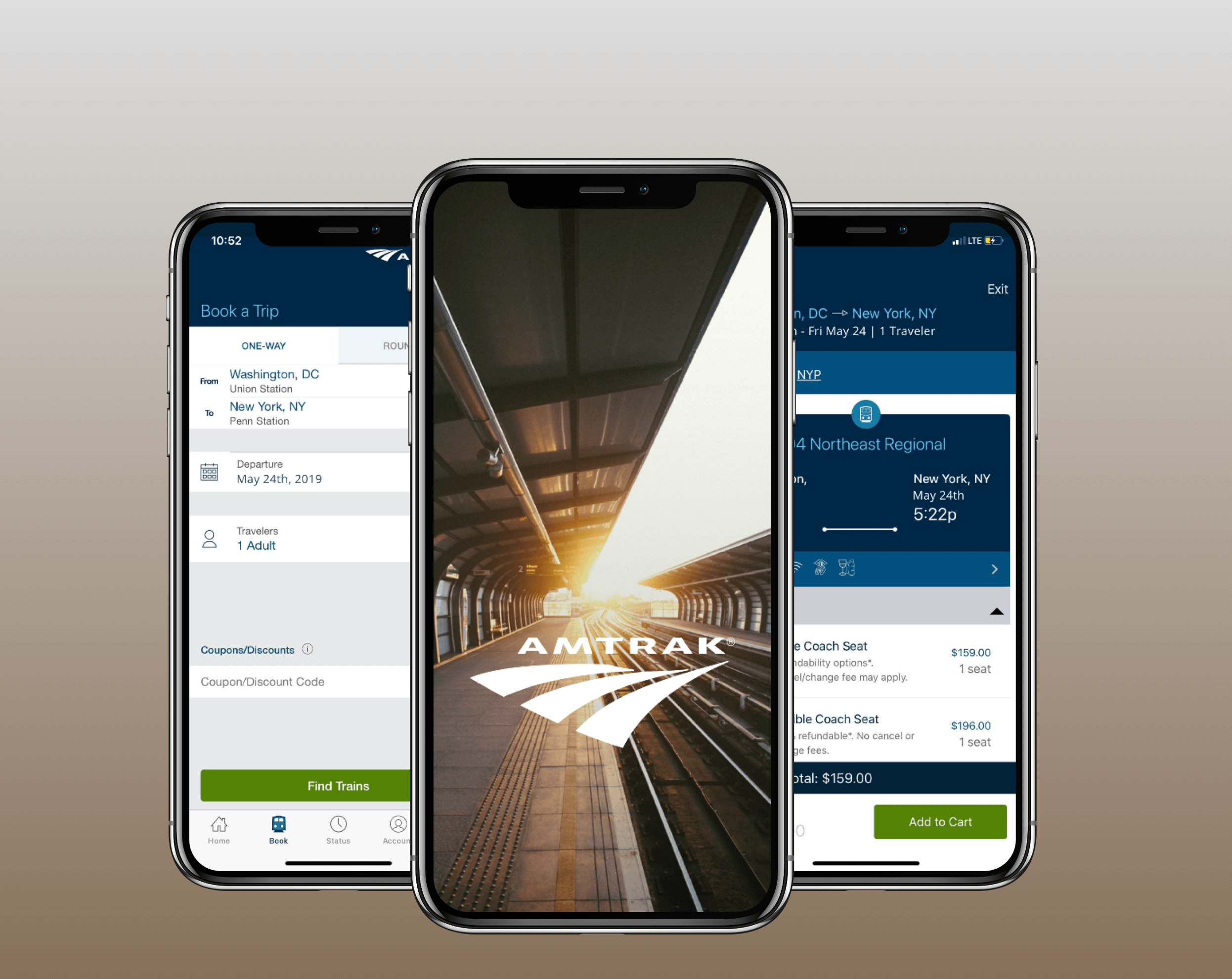
Lead mobile design effort for Amtrak’s Rider App 3.2 Release, including the addition of new features (1) My Trips (2) Passenger with Disability (3) Traveler Information (4) Multiple Forms of Payment (5) Travel Alerts
THE TEAM
Design Team — 6 designers, 1 UX Director
Development Team — 3 Developers, Tech Lead
Functional Team — 2 Business Analysts
Mobile Product Team — 2 Product Owners
MY ROLE
Wireframes — Prototypes — Visual Design — Usability Testing — Visual QA — Project Management
THE PROCESS
On Amtrak’s Rider 3.2 Release, I was tasked with leading the design effort for multiple new feature additions, including My Trips and allowing multiple forms of payment. Because this release was so intensive, we hired an external team of designers to assist with the flows. I managed the weekly tasks for all designers on the project and ensured the designs were being delivered on-time and according to Amtrak’s style guide. Every morning, the design team would meet and present the work from the previous day; this helped us stay on track while juggling multiple assignments.
After dev hand-off, I stayed on the project at a high level to assist the dev team with questions or concerns. Sometimes, the design flows didn’t translate and I needed to provide extra clarity to the developers, while other times certain elements or icons weren’t implemented properly. In these cases, I provided visual QA docs for the developers to reference.
FUNCTIONAL DOCS
With assistance from the functional team, the story list became our north star during the design phase. These documents were indispensable in helping me keep track of each designer and the flows they were working on.
BASEFLOW
As a jumping off point, we had previous versions of the Rider App to reference. The overarching challenge with Rider had to do with the fact that Amtrak’s global digital style guide was being updated in tandem with the App Release. This forced us designers to make sure the new screens and flows were adhering to the updated guide. We stayed in constant communication with the marketing and the other designers.
Day-To-Day
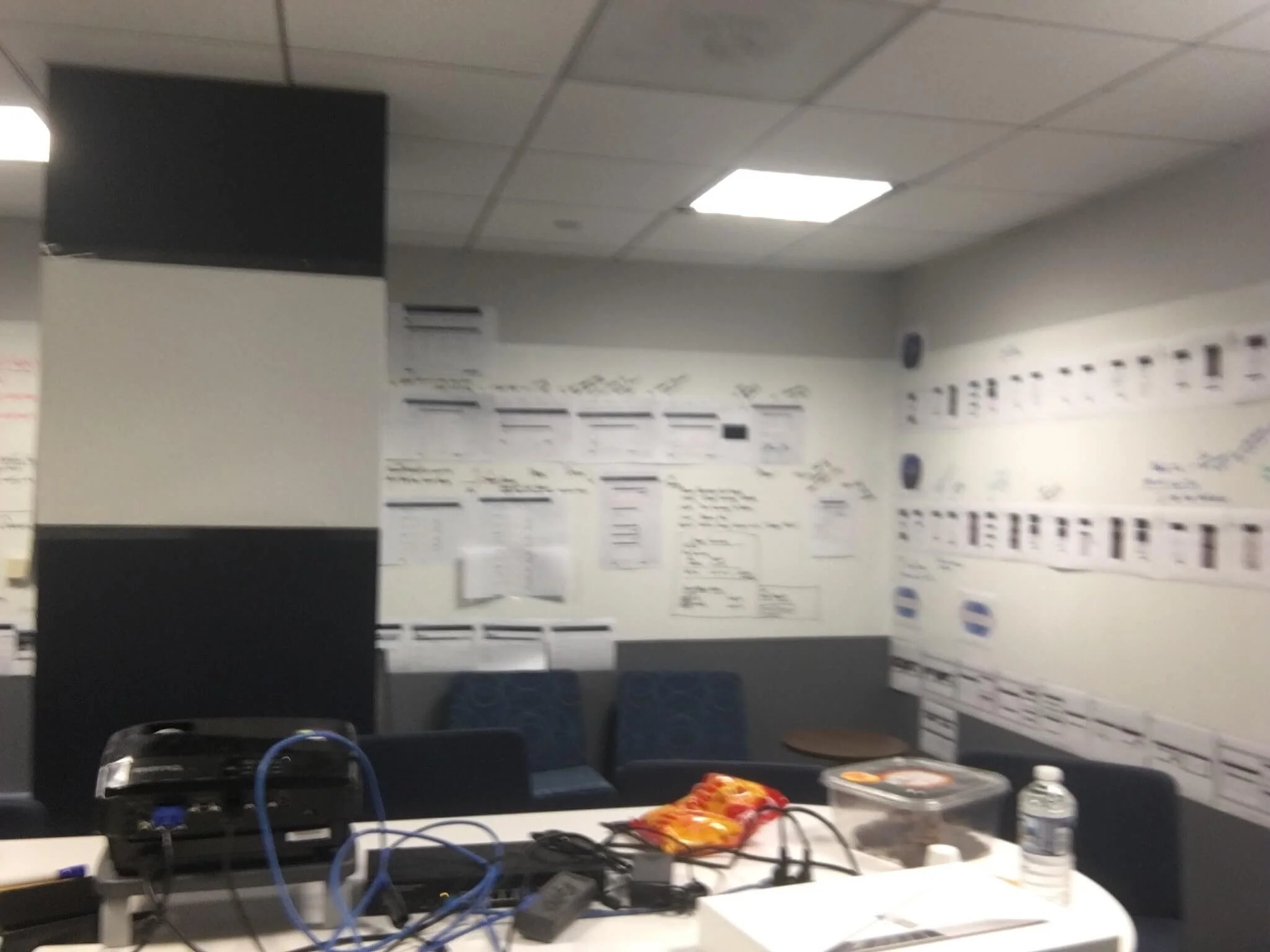
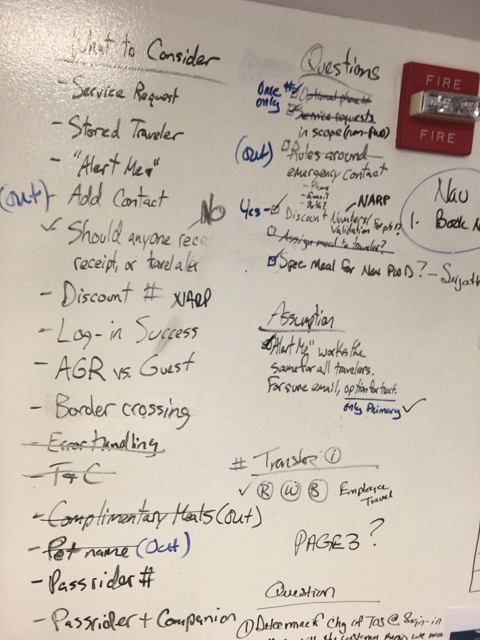
When not in meetings, the design team would work together in a shared room. All four walls had whiteboard, so we’d collectively update our work and share progress with one another. We’d paste our fresh wireframes on the wall and walk the team through the flow, answering questions or concerns as we went. It was enormously helpful to know where everyone was on their project, and how updated requirements or increased scope would affect your own project’s workload.

Wireframes
New features such as PWD (Passengers with Disability) were wireframed first. Features that were being built off of existing baseline flows started in Visual Design iterations.

Visual Design
Our deliverable hand-offs included annotations for the dev and functional teams to view and approve. All story uploads and tracking occurred in Jira. If there was a functional concern on a design - which occurred a couple times a week - we would meet to ensure the designs faithfully followed the business requirements laid out in the functional stories.


Visual QA
I attended demos and developer meetings to follow their progress and field any questions they had on the designs. Following the demos, I would provide Visual QA docs to visually illustrate the design team’s proposed UI updates.

